 Tweet
Tweet
I haven't played an ICC game for quite a few years now: my last purchase was ICC 2000. If it's okay, I'll make an observation which probably doesn't resonate with most users here but which has disappointed me somewhat.
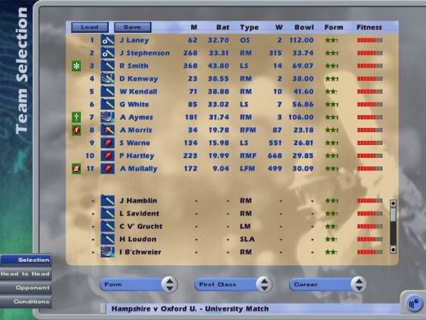
In the ensuing eight years since ICC 2000, it would appear that the game has regressed, at least superficially. Back in the 2000 edition, it was a very sleek, smooth game with a nice clean interface. But the 2008 edition doesn't feel like a professional, commercial game. To be honest, it looks a bit like Cricket Coach, which I don't rate very highly in terms of design. The colours are garish. The interface is cumbersome. When I look at these screens, there is simply no contest in terms of which one is more professional:


Uninteresting font, depressing dark colours, light blue text on blue background and a very rigid and grid-like layout. I'd happily trade away the 3D graphics for a more appealling user interface. Don't get me wrong: I'll still play the game, and it remains one of the more challenging cricket games available, but just doesn't have the same professionalism as it maybe once had.
In the ensuing eight years since ICC 2000, it would appear that the game has regressed, at least superficially. Back in the 2000 edition, it was a very sleek, smooth game with a nice clean interface. But the 2008 edition doesn't feel like a professional, commercial game. To be honest, it looks a bit like Cricket Coach, which I don't rate very highly in terms of design. The colours are garish. The interface is cumbersome. When I look at these screens, there is simply no contest in terms of which one is more professional:
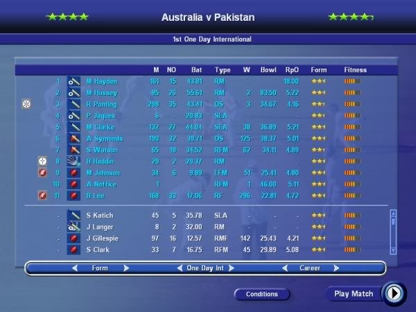
Uninteresting font, depressing dark colours, light blue text on blue background and a very rigid and grid-like layout. I'd happily trade away the 3D graphics for a more appealling user interface. Don't get me wrong: I'll still play the game, and it remains one of the more challenging cricket games available, but just doesn't have the same professionalism as it maybe once had.
Comment